Any designer who wants to stand out at the AGTA Spectrum Awards has to start with world-class gem material and then do something astonishing with it.
That can involve the faceting of the gem, a design that sets it off in an unexpected way, craftsmanship of the piece itself – and preferably all of the above. There are lots of talented designers out there and everyone who enters jewelry for these coveted awards – there were 400 entries this year – attempts to do all those things.
So when the AGTA (American Gem Trade Association) invites jewelry writers in for a look at the results, it’s like being invited to feast at a gem-laden smorgasbord.
I showed you some rings that caught my eye at the AGTA Spectrum Awards editor’s day. Here are a few more pieces that stopped me in my tracks.
Let’s start with necklaces and work our way through some surprising uses of colored stone – because that really is what the American Gem Trade Association is celebrating with this contest.
All photos are my own.
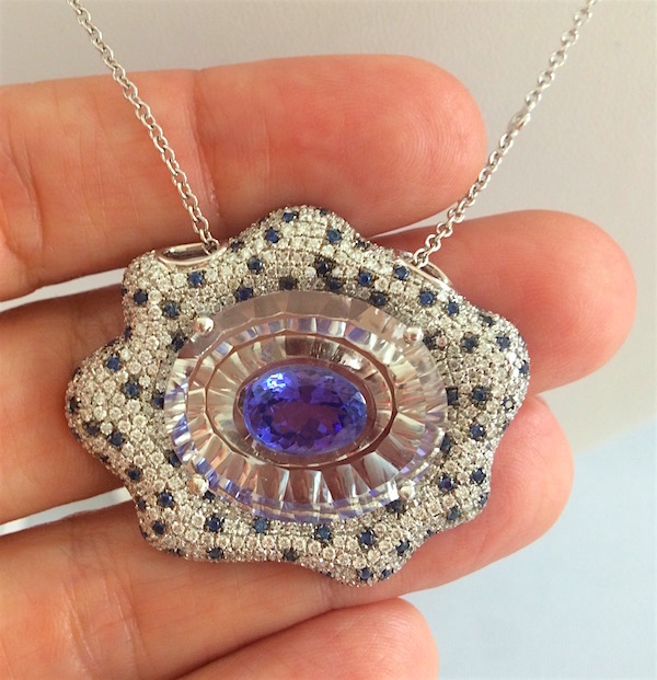
See how that central tanzanite reflects off the facets of topaz it was set in? Stone layered onto stone is one of my favorite things, and this was one of a few examples in that room of the amazing things you can do with topaz in its natural state. Of course, that tanzanite was luscious too. But then the Yael Designs designer decides to give it these layered gems an amorphous, amoeba-shaped frame embedded with diamonds and scatter-shot sapphires. Just a sweet piece.
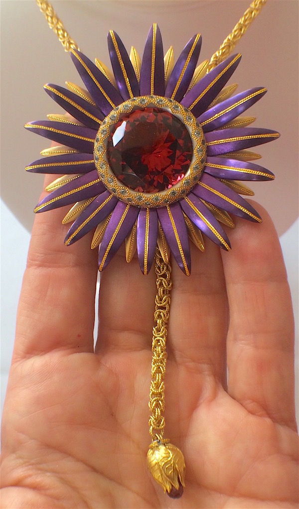
Tourmaline was a source of endless surprise and delight at the preview. If there is one stone that penetrated the design zeitgeist this year, I’d say it was tourmaline. I showed you some Paraiba tourmaline and green tourmaline rings in my last post. The juicy raspberry-colored stone at the center of this pendant is a fine example of yet another of the many rich variations this gemstone can take.
But what to do with that perfect round stone? Hey, let’s surround it with textured high-karat gold, gray sapphire accents, and purple steel petals! Not the predictable route.
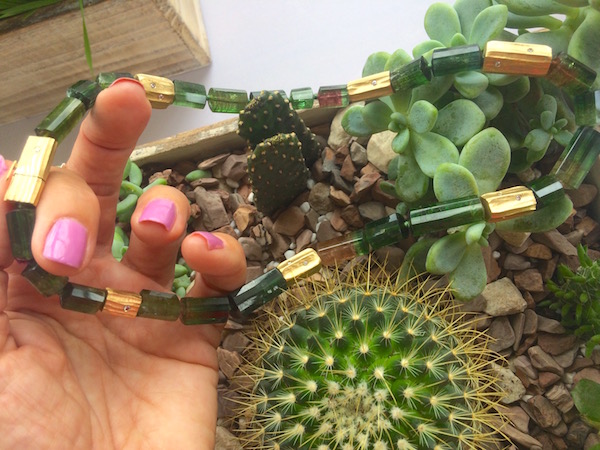
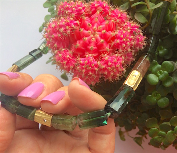
Ah, here’s a more recognizable tourmaline: beads formed from watermelon tourmaline crystals interspersed with gold beads cast in their image and scattered with diamonds. This was not the most mind-blowing design I saw that day, but isn’t it lovely? How much do we love watermelon tourmaline in all its natural glory?
And, by the way, who’s brilliant idea was it to put all those colorful succulents by a south-facing window and then set a bunch of camera-wielding jewel hounds on them? You should have seen us that day: kids in a candy store.
Let’s move on to bracelets, starting with the jewel that caught my attention the moment I entered the room.
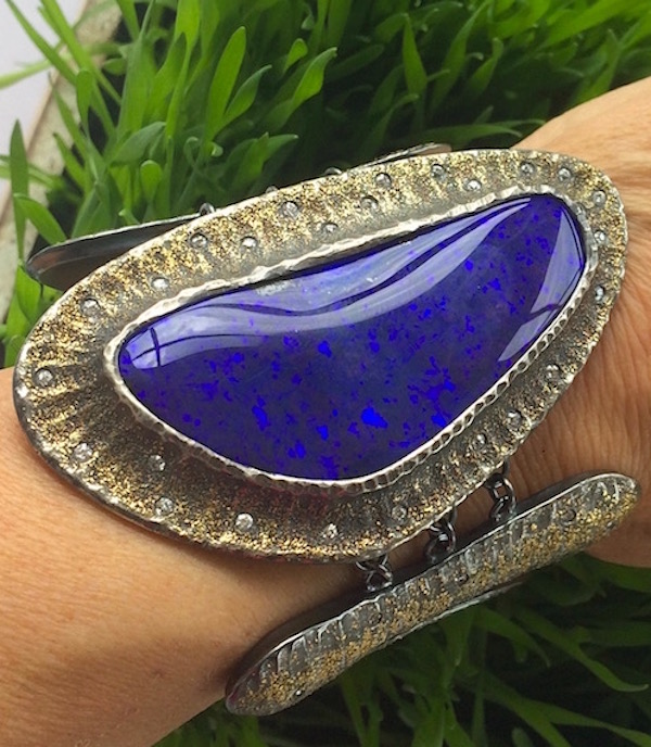
Yup, another by Michael Endlich, this time designed around a 115-carat boulder opal. Endlich chose to complement its mirror surface with textured sterling dusted with gold. All gold would have been a bit much but a blue that deep called for at least some. This was a nice compromise, with diamond accents scattered around it like stars.
But how do you wear a rock that size? Only two body parts could support it, the neck and arm. The designer voted for the one that allows the wearer to most easily gaze into the deep blue sea of this stone. He came up with an interesting way to keep it secure on the wrist, by linking it in three places to oblong disks of metal. You have to see the video to fully appreciate the rest of those links.
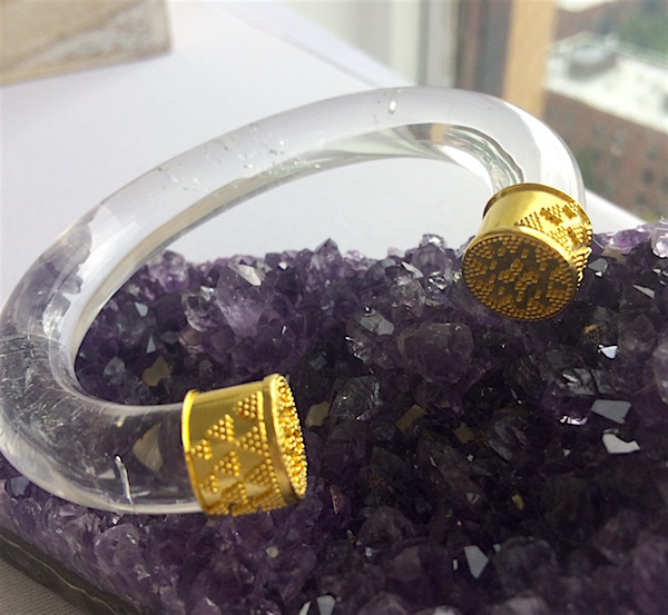
At the other extreme, here’s a simple and wearable bracelet reminiscent of a style popularized about 2,500 years ago – one that never gets old. This bangle was created by Loren Nicole, a young designer I met this year in the emerging designer aisle outside the Couture Show in Vegas. Nicole is diving headlong into the ancient jewelry arts, working with a lapidary artist who’s producing quartz cuts like this and adding the kind of gold work perfected during the Etruscan period – which is to say: very fine granulation.
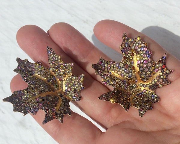
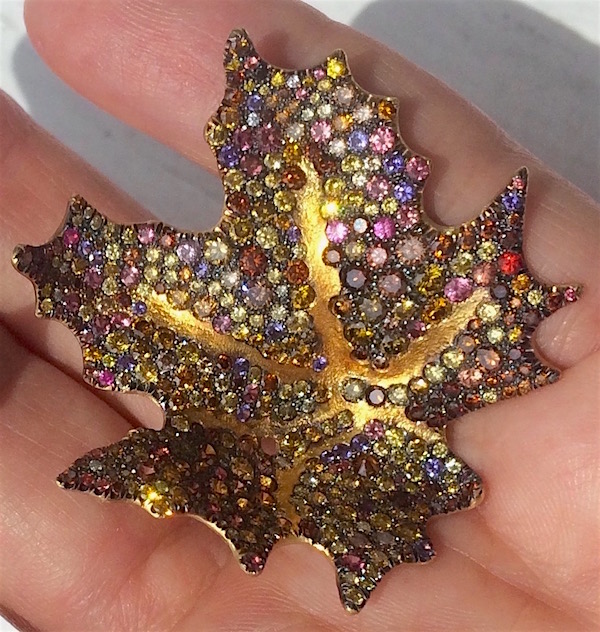 I’ve saved the best for last. These exquisite earrings by Naomi Sarna were crafted from 18k and 24k gold embedded with multicolored diamonds, sapphires and garnets. They won “Best Use of Color” at the Spectrum Awards this year. I applaud the judges for their choice but, apparently, it was one of the toughest they had to make.
“There was a huge debate over what should be best use of color,” one of the judges, gem carver Sherrs Cottier Shank, told me. “We had several pieces we were considering. There were so many possibilities and we couldn’t come to an agreement.”
I told her I loved the piece they chose, but could see why it would be a tough choice. The whole point of the contest is color! It’s just an amazing feast of nature’s color. Yet all judges have to come to agreement on the meaning of “best use.” What ended up winning is, I think, a very sophisticated use of color.
“I agree,” Sherris said of Naomi Sarna’s maple leaf earrings. “It was both understated and colorful. There was nothing flaunting about it, but you couldn’t miss it. I think it was an extremely successful piece.”
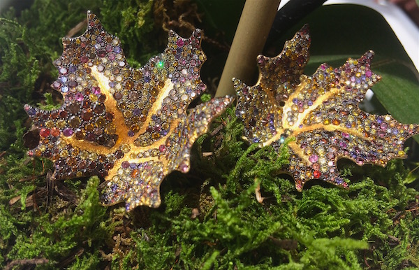
With these earrings, I think Naomi Sarna perfected the tweed technique of pavé used by Joel Arthur Rosenthal and took it a step further. Instead of just variations on a hue, with a couple complementary highlights, she mixed together an entire palette.
Cheryl Kremkow described these earrings as a “pointillist painting in gems.” I couldn’t have said it better! When you move these earrings around a few feet from the eyes, they give off a glittery light show that hints at the glory of autumn. (Watch my video to see what I mean.) But when you look closer, you see they’re only partially composed of colors we associate with fall – cognac, amber, orange – but also purples and pinks. The satin finish of the rich high-karat gold veins pulls it all together. It’s the work of a true artist.
Related product


